ClearCare posed a creative challenge focused on improving the relationships between patients and their personal health.
Click to jump to a section:


UX Design
User interviews, flow maps, A/B testing, low-fidelity prototypes
UI Design
Logo, brand identity, typography, motion design, visual assets
Final Presentation
3 interactive prototypes, stakeholder presentation, iterative user testing
Overview
CONTEXT
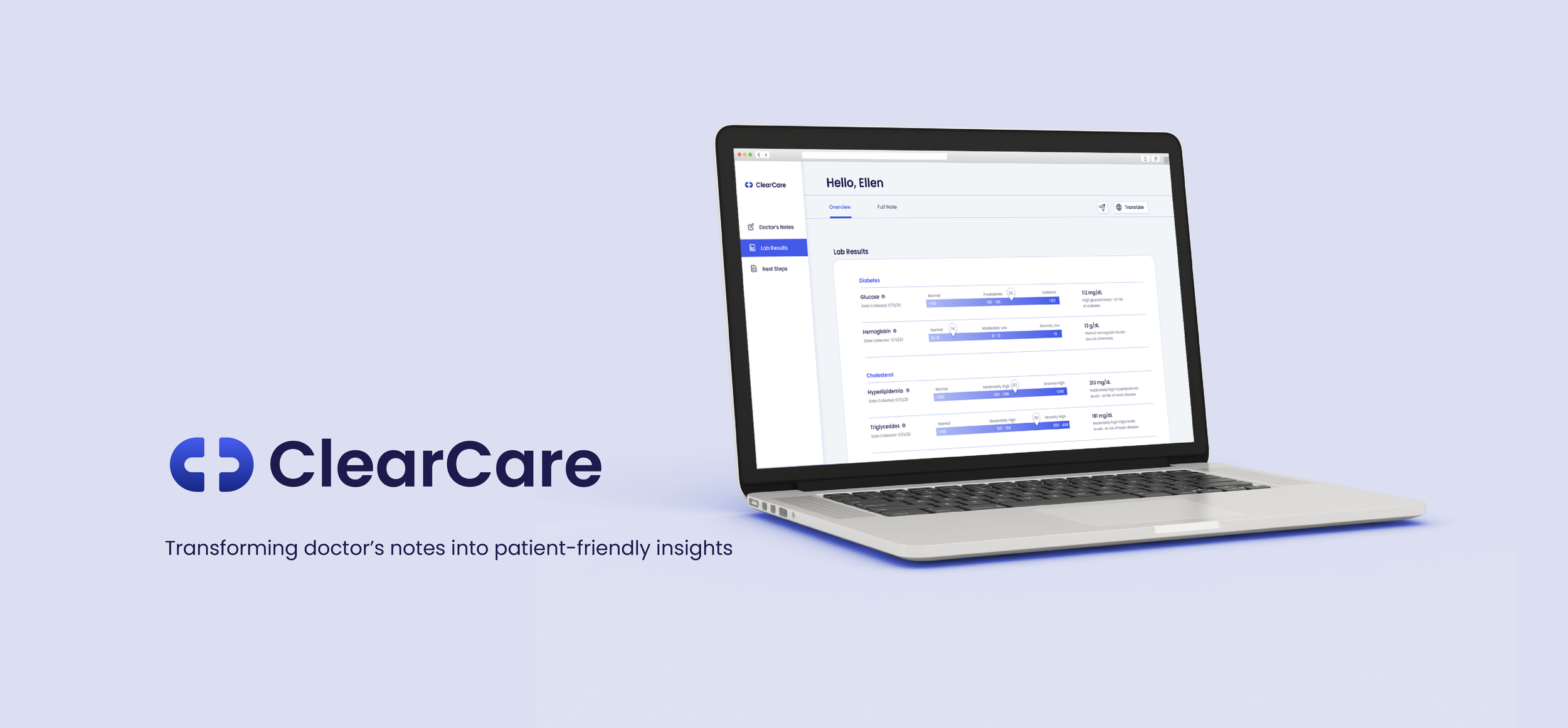
ClearCare is a one-stop solution to provide efficient communication and increased accessibility towards health conditions, lab results, imaging, doctor notes and medical summaries. The platform uses artificial intelligence (AI) to process medical documents, extract key information, and generate clear and concise summaries.
CHALLENGE
Electronic health records are designed for healthcare professionals and contain complex medical jargon. Additionally, for patients with English as a Second Language (ESL), language is often a massive barrier. ClearCare aims to make medical records and test results easier to understand for all.
OUTCOME
ClearCare was designed for patients of varying ages, ethnicities, and technological proficiency who are seeking efficient access to medical data.
TEAM
James Poe, Jasper Chang, Ajit Alapati, Alex Nelson
ROLE
UX Design, UI Design, User Research
TOOLS
Figma, Sketch, Adobe Creative Suite
TIMELINE
August 2023 - PRESENT
Define
RESEARCH
In the initial project phase, I conducted secondary research to explore users' needs in interpreting medical notes. The following highlights from a focus group discussion offer insights into patients' perceptions of their doctors' notes.


Additionally, a significant emphasis was placed on patients with English as a Second Language (ESL). In order to ensure an equitable design, I wanted to address the unique challenges faced by ESL users.
Ideate
PROBLEM
Understanding your health should be straightforward, but doctor's notes can be difficult to decipher! As seen in the situation below, doctor’s notes often come in dense blocks of text laden with medical jargon. This issue leads to confusion, misunderstandings, and ultimately hinders the patient's ability to actively engage in their healthcare journey.

In the ideation phase, I talked with users from different age groups/ levels of English proficiency to better understand their needs. I organized my findings with affinity diagrams and empathy maps.


SOLUTION
Through these findings, I honed in on three key challenges and a refined solution statement.
To address the challenge of comprehending medical results, ClearCare is designed to provide clear and concise summaries of doctor notes, additional resources to supplement the patient’s understanding, and translations into different languages.
Design
DESIGN EXPLORATION
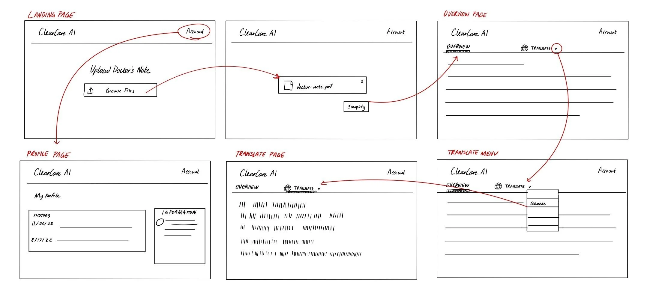
I collaborated with our engineer to establish the scope of the project and to ensure a seamless and intuitive experience. Using our research insights, I created a user flow and sketches that directly address the identified pain points of patients.

Iterations
WIREFRAME TESTING
I started wireframing by conducting A/B testing with 25 participants (students, senior patients, ESL patients) for two user interface designs. The focus was on comparing the effectiveness of tabs versus scrolling navigation methods.

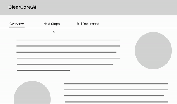

After receiving feedback, I discovered that the tabs provide a structured and organized layout, but interrupted the user flow. Conversely, scrolling provided a holistic view of the information, but users prefer to toggle to the original document. In the final solution, I opted for a combination of both interfaces.


USER INSIGHTS
I surveyed 30 respondents to gain a better idea of their experience with the interface. I compared the previous interface with the new interface, and conducted task success rate tests.


User Interface
BRAND IDENTITY
I aimed to create a brand identity for ClearCare that feels approachable and reliable. With a palette of calming blue tones and a round, friendly font, the brand creates a comforting experience for users navigating their health journey.


MOTION STATES
ACTIVATED

PROCESSING

ERROR
ERROR
INTERFACE DESIGN
The interface design was guided by universal design principles, ensuring that it is easy to navigate for all users, regardless of their technological proficiency.


Outcome
SOLUTION
Many iterations later, ClearCare has evolved into a user-centric platform designed to provide a more intuitive experience for reading doctor's notes. With an emphasis on increasing accessibility for ESL patients, ClearCare aims to provide a seamless and user-friendly interface.
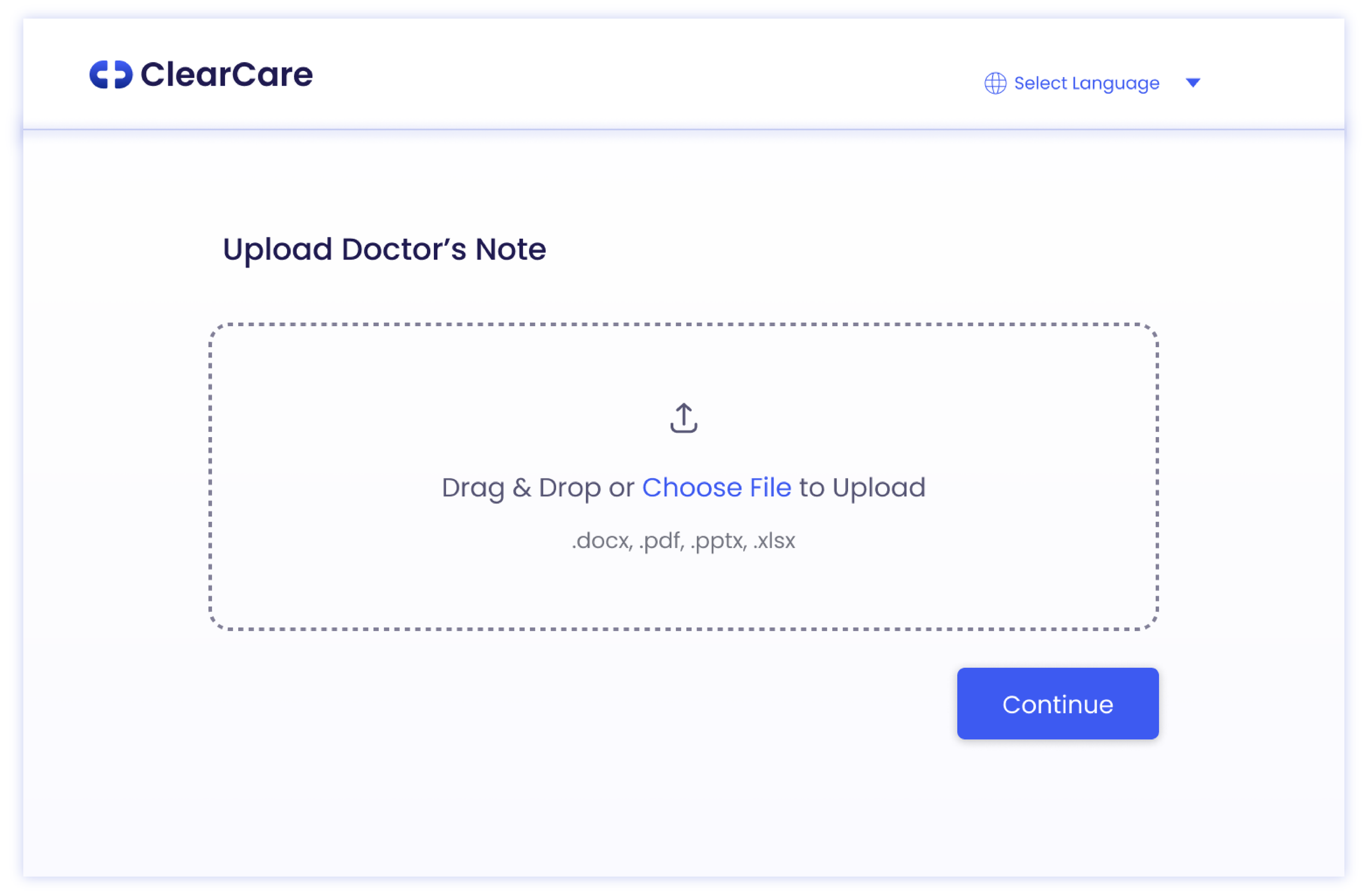
Summarize Doctor's Notes
Translate complex medical notes into understandable insights, providing patients with a clear understanding of their condition with clear next steps and treatment plans.
Simplify Lab Results
Convert lab results into visually intuitive formats and eliminate confusion by providing explicit explanations for each test conducted.
Instantly Translate Page
Translate entire page with the translation feature, breaking down language barriers and ensuring accessibility.
Reflections
THE ONES THAT GOT AWAY
My key takeaway from this project is that design is not always linear! Collaborating closely with the team, we explored a multitude of ideas and concepts that ultimately did not make the final cut.
This prototype was made during the initial phase of the design to demonstrate the backend development of the simplification and translation feature. Adapting to the challenges and constraints inherent in the initial prototype, the team iteratively refined this design to align with the project's goals.
LEARNINGS
As we iteratively added more and more features to ClearCare, I realized the need for a complete UI redesign. This taught me the value of a holistic design approach, emphasizing an integrated design ecosystem over individual pages for better scalability and coherence.
Working in a startup environment required me to adaptable. Beyond my primary role in UX/UI design, I found myself delving into visual design, communications, and marketing. This approach not only allowed me to become a more versatile designer but also underscored the importance of adaptability and cross-functional collaboration.
A key learning from working in a collaborative team environment, especially as the sole designer, is the value of diverse feedback. The success of the project was dependent on the shared passion and belief in the product by all team members.
NEXT STEPS
The upcoming phases for ClearCare involve collaborative testing with developers and Quality Assurance teams. This aims to ensure that my prototypes are feasible, while maintaining alignment with the shared vision and goals established during the development phase.