CONTEXT
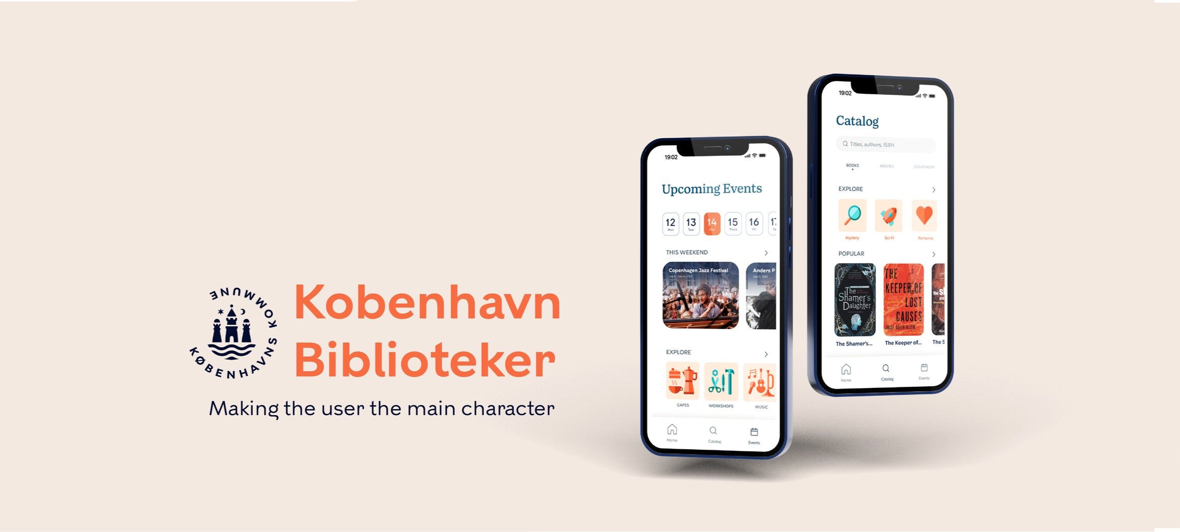
In 2023, I had the opportunity to study design in Denmark and work on a project with København Biblioteker (KB)- Denmark’s public library organization. KB is recognized for promoting inclusive access to education and community engagement throughout Copenhagen. In addition to books, the libraries offer a range of services, including communal dining, craft workshops, and academic support resources.
CHALLENGE
As sites increasingly shift from desktop to mobile platforms, KB recognized the need for a digital refresh. Therefore, I was challenged to design an app interface that effectively communicates the library's diverse range of services. This initiative aligned with KB's strategy of staying relevant in an evolving digital landscape while maintaining its commitment to inclusivity and community engagement.
THE USER AND THEIR NEEDS
The KB app caters to a diverse user base, spanning from Danish citizens to international students. This user group comprises individuals with varying ages, backgrounds, and levels of technological proficiency. Users sought a seamless way to not only browse for books but also to access all services provided by the library.
TEAM
Independently led initiative with guidance from design professor
ROLE
UX Design, UI Design, User Research, Brand Identity, Graphic Design
TOOLS
Figma, Sketch, Adobe Creative Suite
TIMELINE:
4 weeks
Define
EXPLORATION
In the initial stages of the project, I familiarized myself with the 20 libraries within the KB system. While each library had its own unique character, they all boasted an astounding amount of provided services. Here are just some of the services offered at the public library:

RESEARCH
Through interviews with library staff, library visitors, and international students, I gained insights into the needs, challenges, and expectations of the library’s user groups.


Ideate
PROBLEM
From these explorations, I discovered that Copenhagen libraries are so much more than book repositories- they are vibrant cultural hubs where the community gathers to share resources.
However, users expressed frustration over the limited awareness of the events and resources offered by the library. International students especially have limited knowledge of the libraries and the wealth of cultural experiences they offer. This leads to feelings of loneliness and isolation.

THE USER AND THEIR NEEDS
After open card brainstorming with 8 participants, I honed in on a specific focus statement:
How can libraries increase engagement while also creating a sense of belonging?
SOLUTION
In response to the user needs revealed during the research phase, I decided that the KB app design needed to extend beyond the basic functions of reserving and checking out books. It had to adapt to each individual, ensuring the library can cater to their needs, be it checking out equipment, going to events, or anything in between.
Through visual storytelling, I wanted to put the user front-and-center of their own library adventure.

Make the user the main character!
Design
USER FLOW
I started by creating user flows that consider current features of the KB site, as well as potential features that address the needs and preferences of library users.

A/B TESTING
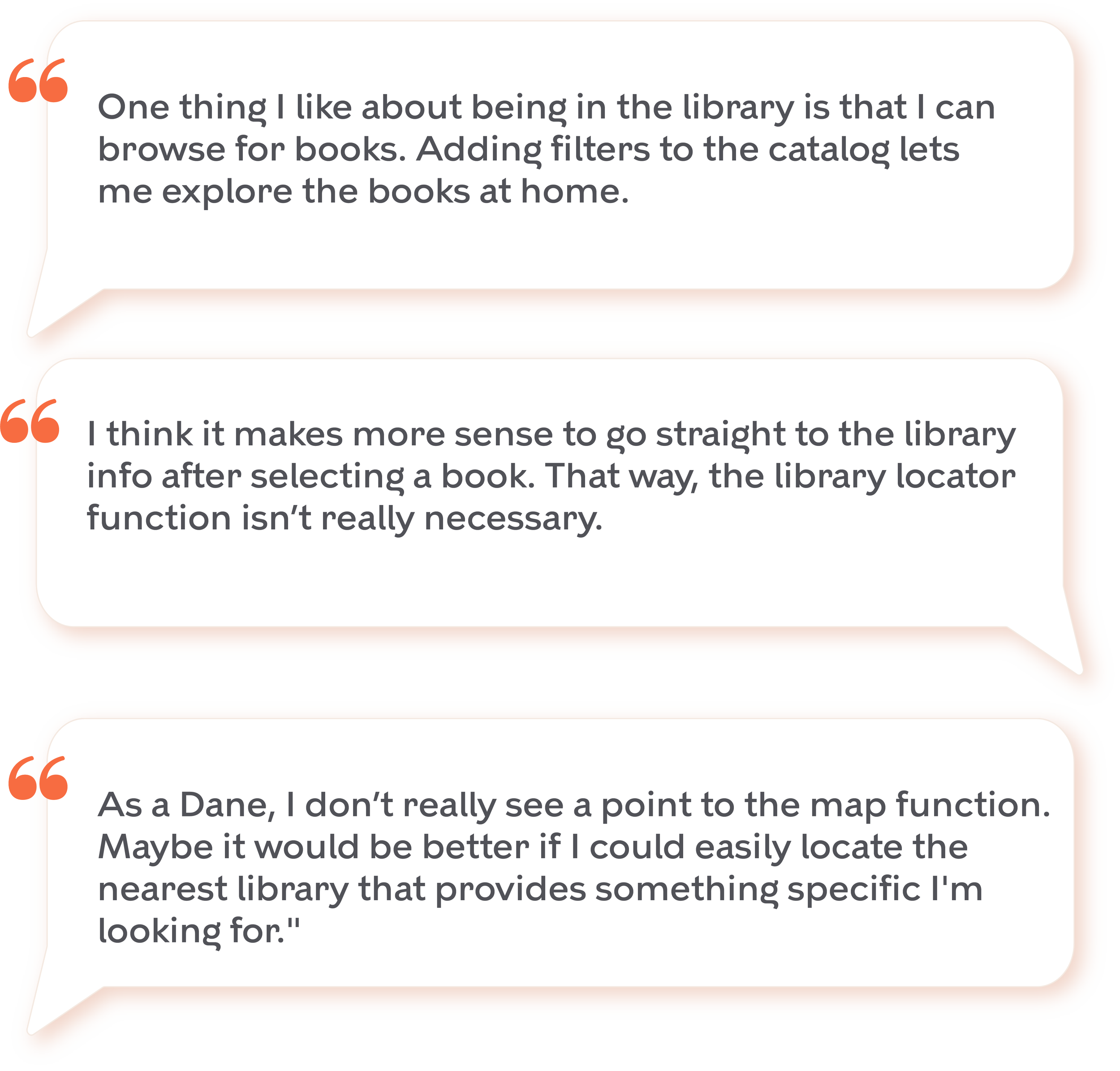
The A/B test focused on evaluating two interfaces for accessing library information. Variant A featured a dedicated "Library Locator" tab, offering users a location tab for discovering library locations easily. In Variant B, library details were accessed contextually, linked directly to specific books or objects of interest.

Test A

Test B
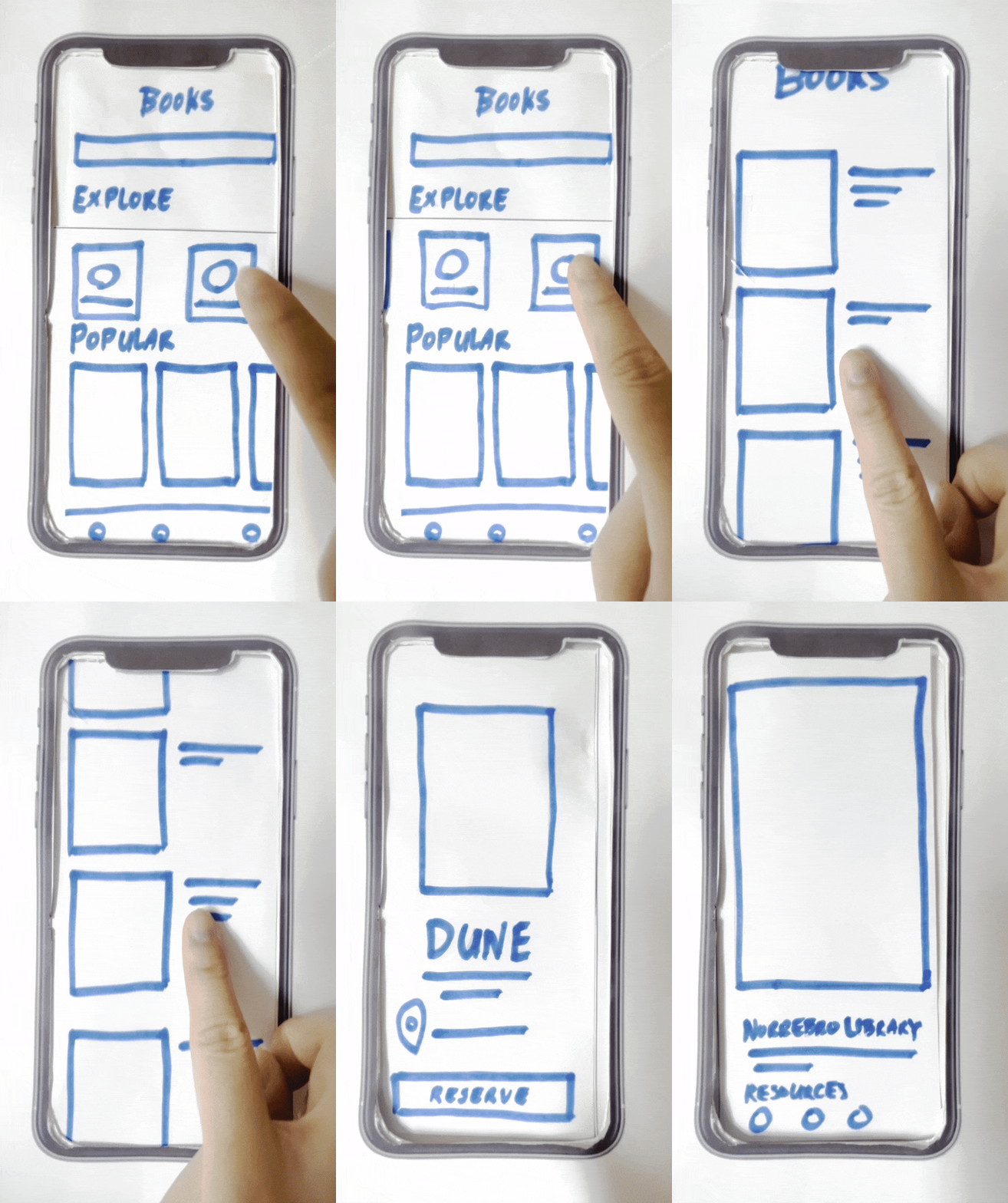
In response to user feedback gathered from 15 participants (international students, local citizens, library staff), I created a paper prototype that focused on refining the Variant B interface – accessing library details contextually through the selection of a specific book or item.

ITERATIONS
The key insight I gained from feedback was that KB users were seeking a more personalized experience beyond generic information like the library's location. Following a particularly insightful conversation with Nørrebro Library staff, it became apparent that there was a demand for more active user engagement.
Through user feedback, I saw an opportunity to create a personalized user hub that uses badges to encourage participation within the library community.


Graphic Elements
VISUAL IDENTITY
During my stay in Copenhagen, I drew inspiration from the city’s vibrant and distinct design culture. I chose colors and visual elements that are playful and had a quintessentially Danish aesthetic.
RESTRICTIONS
In adherence to brand guidelines, the KB app used KBH Sans as the primary typeface, designed by Playtype. To add a touch of timelessness and to balance the modernity of KBH Sans, I chose Bogue Slab for the accent typeface.
I was also tasked with incorporating the official København Kommune logo, designed by KK Design.

ICONOGRAPHY AND BADGES
I designed a set of icons to complement the brand's identity, mirroring the typographic details of the KBH font. The goal was to achieve a balance of sophistication and playfulness, creating elements that exude the same energy and adventure as the KB.


Outcome
SOLUTION
The KBH Library App's design and development process culminated in an interface that redefines the traditional library experience. The app becomes a dynamic and personalized space, adapting to individual user needs while encouraging community engagement.
Overview
I created a Home page that allowed users to immediately view their reservations and holds.
Make a Reservation
The app features a user-friendly reservation process for both books and equipment within the Copenhagen library system. My aim was to streamline the process, making it effortless for patrons to find, reserve, and manage their items of interest. The app also includes a map feature, enabling patrons to locate the nearest library offering a specific resource.
View Upcoming Events
The new ‘Events’ interface allows users to effortlessly browse and access information on all library-sponsored events. I introduced a badge system to incentivize users for attending events.
Reflections
NEXT STEPS
I presented the final prototypes to the Nørrebro Library team and received positive feedback and support. For the next steps, I plan to continue designing additional pages and conducting iterative testing with users to refine the user experience further.
IF I HAD MORE TIME
While not required for this summer project, in an ideal scenario, I would allocate additional time for collaborative testing with developers and Quality Assurance teams. I would ensure that my interactive prototypes undergo thorough testing, guaranteeing not only executability but also alignment with the shared vision and goals during the development phase.
WHAT I LEARNED
Data Collection & Analytics
Through this project, I had the valuable opportunity to refine my skills in gathering and analyzing user feedback through various channels, primarily surveys. Creating visualizations allowed for a comprehensive understanding of patterns, trends, and outliers within the data.
Connecting with the Human Aspect
One of the most enriching aspects of this project was the opportunity to engage with users on a personal level. Conversations with individuals from diverse backgrounds in Copenhagen added a human touch to the design process.
Evolving Design Systems
By taking an existing platform and transforming it to a different form, I honed my ability to craft scalable, unified design systems. This showed the importance of fluid and responsive experiences.


